Top 10 Responsive Web Design Considerations
By admin on 05/04/2012
I always wanted to write a "Top n somethings" post and it just so happened I found myself compiling a list today, so here it is. The title is also a bit of a fib, I only came up with a top 9 so far, but who uses "Top 9"? I will add #10 in due course as I have other ideas but nothing as certain as this first 9. You may well have a differing opinion and I encourage you to share that with me and everybody else.
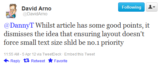
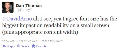
So there was a brief but interesting conversation on Twitter today after I shared a link to this great post about responsive web design.
David Arno suggested the author was dismissing that the font size should be the number 1 priority when delivering a web experience to a mobile device.
I acknowledged this and suggested that font size coupled with an appropriate screen width is vital.

Offline (in the office) Pete contested that speed was the highest priority and Lawrence pointed out the frustration experienced of spending time and data allowance downloading ads.
Finally, Stray chimed in suggesting that contrast was also worthy of key consideration to be conducive to comfortable reading.

Several very good points in quick succession. So I thought I'd have a quick brainstorm on what are the key considerations when designing a mobile web experience. So here are my Top 10 <ahem 9> considerations for responsive web design*.
*Note: these are not in any priority order, they're all important and picking the "winner" adds no value here.1 - Font Size
We're browsing the web on a huge array of computers and devices now, some are small with large resolutions, some are large with low resolutions and every combination in between. Using a large enough, clear font improves the readability of your website no end.
2 - Layout width
In all but the quirkiest of sites, horizontal scrolling is considered a big no no. For me, the same applies to devices. There's nothing more annoying than having to fiddle around swiping left and right as you read a multi-line paragraph of text on your phone. Don't make me do it!
3 - Download speed
We're getting ever nearer to having high-speed internet everywhere. But we're not there yet. I frequently take the train from our office in the middle of nowhere up to London and the mobile data reception is all over the place. Don't make me wait whilst you force reams of JavaScript on me to make your super-nice roll-over effects. I'm on a touch device and I aint gonna see em. Unless it's absolutely key to the experience, give me the minimum amount to download I need to digest your content.
4 - Contrast
We're no longer chained to our dimly lit desktop caves with bright glaring monitors. We're accessing the web from pretty much anywhere. Inside and outside, day and night. Make use of appropriate contrast so I can actually see the content you've so lovingly prepared.
5 - Content prioritisation
Now we're using narrow mobile devices, the priority order of your content is more vital than ever. Yes that is a lovely looking mega-menu on my 30" desktop widescreen monitor, unfortunately it's a bad dose of RSI when haivng to scroll through it on my phone. Users browsing on mobile devices are much better served the primary content. Big menus, sidebars and other filler aren't so appealing when you don't have the space and convenience of a desktop so either leave them out or if you must have them put them further down the content hierarchy.
6 - Noise elimination
Along the same lines as content prioritisation, do you really want your mobile users to spend their time, bandwidth and attention span on your ads? Certainly some sites depend on this revenue but if it isn't absolutely essential, leave it out. Your users will thank you for it (okay they probably wont but you'll sleep better... possibly).
7 - Physical interactions
If I'm on a phone/tablet/other touch device: I HAVE NO HOVER. Hiding your nav under roll-over states is completely wasted on your mobile audience. Bear this in mind and also the size of your clickable elements, some of us have fingers somewhat fatter than the tip of a mouse cursor.
8 - Device Capabilities
I'm on my phone and I'm coming to visit your business. Why not make my job easier and hook your 'find us' page into my current location? Modern devices have some great capabilities such as location services, cameras, accelerometers and who knows what else is in store for the future? Keep an eye on supported browser features and deliver something extra where it adds value.
9 - Context awareness
In a similar vein to the the previous example, be sympathetic to your users context. You can access my location and you know I'm on a mobile device. Why not use that information to make my experience better? I said I'm coming to find you, why not default the address of your nearest store to me when I access your contact us page? Perhaps lookup the current weather and if it's bad, provide me a taxi number or public transport information along with any traffic/delays. Now you're winning me over!
10 - ???
- Tags:
- Uncategorized
