Theme update: responsive images for wordpress
By admin on 04/03/2012
This is really basic stuff but I made it hard on myself by digging through the sample themes and thinking there would be more to it. To make all images appear no larger than the size of the browser being used:
    img {

      display: block;

      margin: 0 auto;

      max-width: 98%;

      height: auto;

    }
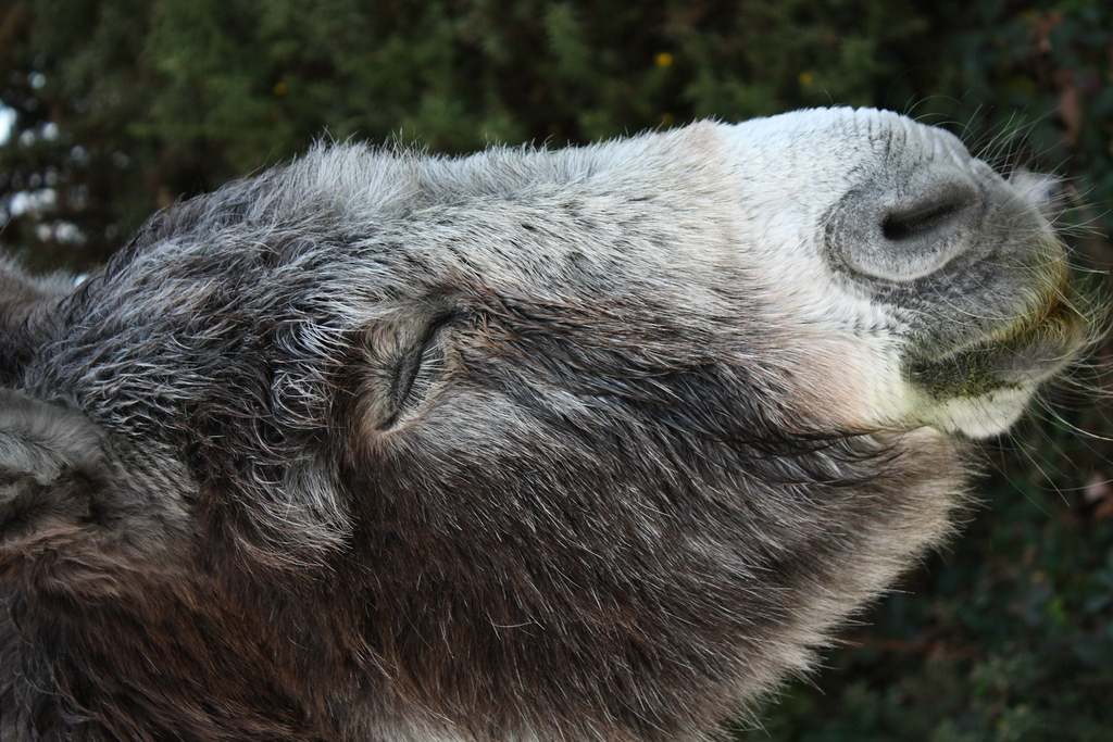
Here's a big image of a Donkey that'll resize to fit the browser window size:
Something I intend to do some research on is dynamically loading higher quality images based on display size and bandwidth available but I think that will require a little more effort so this approach will do for now.
- Tags:
- Uncategorized